
Helping healthcare staff minimize administrative burden by up to 80% for patient affordability in a $40B market
Note: To maintain confidentiality, mockups/images are blurred. Some details are generic for the same reason.
💼 Company
Amazon Web Services, Healthcare and Life Sciences
👤 Role & Team
Sole UX Designer and Researcher on a team of 35 ENG, 3 SDMs, 4 PMs and 3 Biz Dev
I joined the team as the only UX Designer after a working prototype was created.
🤔 Product Context
0-1 healthcare product with a 2-sided customer base, 3 personas and heavy legal requirements.
Learning about the treatment and cost support space
50%
Patient abandonment before their first treatment
20%
Patient awareness of treatment supplier cost support
15hrs/wk
Spent by healthcare providers on treatment related paperwork


I led a journey mapping session with internal SMEs and the product team + interviewed 4 sets of relevant healthcare actors (including patients)
The product
The product creates a new channel for cost support sign ups offered by treatment suppliers. It's directly integrated with the EHR, digitized, and is connected to everyone involved from patients to the supplier themselves.
Initial hypothesis of the cost support sign up workflow

Big learnings after direct exposure to target health system customers
The new workflow
We quickly pivoted to update the workflow based on customer needs while preparing for pilot launches.

Defining the patient experience
Existing cost support channels are confusing to navigate, don't clearly share value proposition and throw around legalese. This creates a burdensome and distrustful experience for patients who struggled to find an appropriate treatment and finally have a chance to improve quality of life.

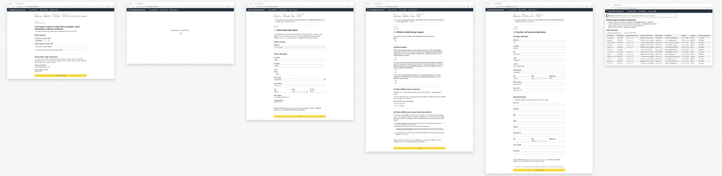
Patients receive a branded message from their health care provider, and simply review information to enroll in cost support.
The UX focuses on patients by sharing the benefits of signing up before asking for information. Additional consents are clearly marked as optional.
I worked with our pilot supplier to get to a simpler, clearer UX that significantly cuts down legalese while clearly sharing cost support benefits. This design vision + findings from UX research I conducted helped influence them to improve their privacy copy/UX on their next round of content updates.
One staff portal with one standard UX for all treatments from all suppliers
Reduces workload dramatically by pre-populating information from the EHR that simply need to be reviewed
Standardized UX within one portal reduces cognitive burden across different supplier portals
Simplification at the human task level, not just the UI level
Our design system options were limited due to the product's legal posture and positioning within Amazon
Future vision
Support patients taking multiple treatments simultaneously (common)
Support staff end to end in treatment delivery admin work that we dove deep into on this project
Expand into adjacent markets with similar workflows
Better tools to work with suppliers on legal content reviews
✅ Results
I left before the pilot launched, but here are some impacts from the work:
Up to 80%
Reduction in time spent on cost support forms
90%
Potential for industry-level form standardization
5/5
"Very Easy to Use" rating by 8/9 patient research participants
🥊 Additional Impact
Design and product team
Planned and executed 10 research studies to influence the product
Educated 35 ENGs on the product healthcare domain
Wrote 8 "how to" design/research documents + templates leveraged by 3 projects
Accessibility
Led the product team through an accessibility audit that we passed the first time
Set up regular design reviews with an accessibility expert
💡 Key Takeaways
In a health teach, collaborate with legal to work through constraints to move the product forward
The minimum value for your customer in health tech is higher than you think
Be able to quickly pivot based on new insights that are key to your customer experience
Your business model can actually impact which problems you are legally allowed to solve